5 steps to techniques and methods for rendering characters.
Using a flamenco dancer as a reference, let's render a character through all stages to result in a fluid and dynamic little quick sketch. Let's dig in:
Step 1 - Always start by warming up. - Use a site like https://line-of-action.com/ to do 30-second shading poses. Get the darks, mid-tones, and lights in. Get a sense of how little you need in order to communicate a lot!
Step 2 - Adjust your own thumbnail according to your intuition. If you compare the thumbnail below to the thumbnail that was approved by my peers in the previous post, you'll see that they are slightly different. This is because there is some adjustment that's needed to be done just through intuition alone. This is a technique I learned from Marta Nael - she creates a thumbnail that is very striking just by using two colours. There's a strong chance that if your thumbnail is strong in the two-tone phase that this will carry through to the final product.

Step 3 - Add flat colours. So I've already decided what my colour scheme will consist of. From my visual research that you can find on my Pinterest, I've found that Flamenco dancers often wear strong maroon dresses. I'm a fan of using a complementary colour scheme, so for the shadows I think there might be some content missing here?

Step 4 - Consider your light source and start adjusting the values of your work. Where the light hits the harshest or where the body curves outwards, there will be the lightest value. Where a part of the body is hidden by light, shadows will fall. Drawing can be like problem-solving, so really try to zone into this - I like to put on piano music when I'm zoning in. Be sure to limit yourself on this step because we are still looking to express some emotion, and shading that's too smoothed over can appear plasticky. After limiting myself on my time, I take a break to allow myself to see it with clear eyes when I do the final push.

Looking at it at the moment, I'm not so happy with the overall shapes, and I feel like there could be more form - but I am happy with the expressive strokes and the slightly blurred texture and strong reds of the dress's contours. This is close to the reference board I made for the drawing. I might look at it again in the morning with fresh eyes. This will help me to look at the piece critically with some distance.
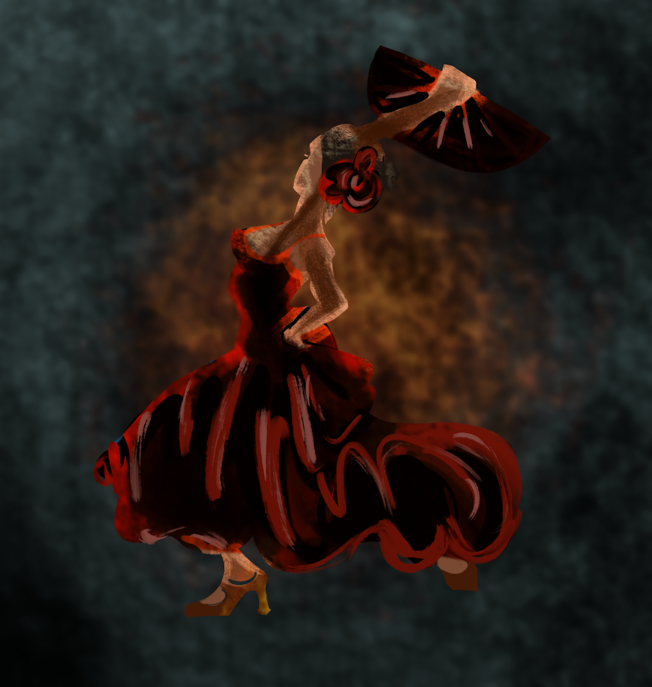
Step 5 - Finesse! - Having taken a break, it's time to adjust small details and add specks of highly saturated detail in different places. Aaaand voila - beautiful piece!